The Cooper Hewitt’s Saturated: The Allure and Science of Color explores the elusive, complex phenomenon of color perception and how it has captivated artists, designers, scientists and philosophers. Featuring 210 objects spanning from antiquity to the present, the exhibition reveals how designers apply the theories of the world’s greatest color thinkers to bring order and excitement to the visual world.
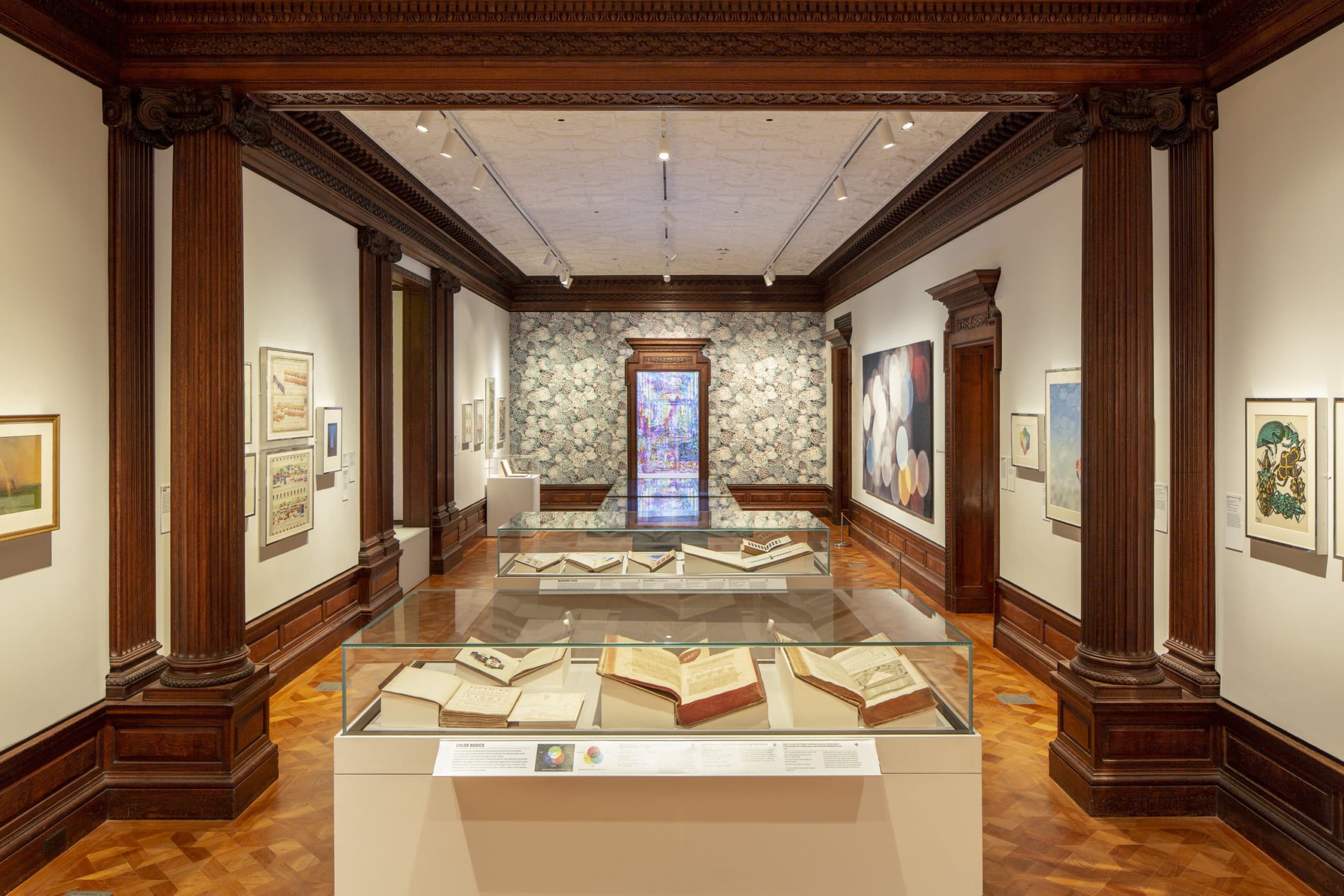
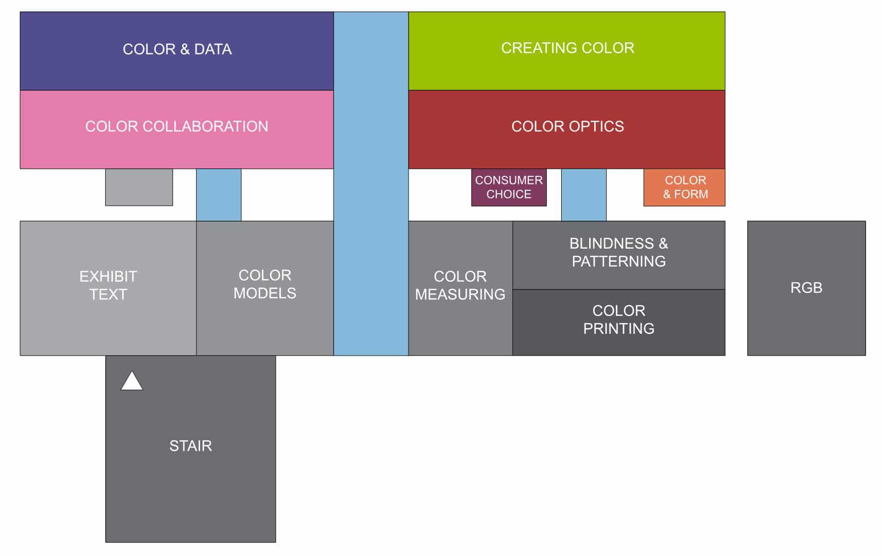
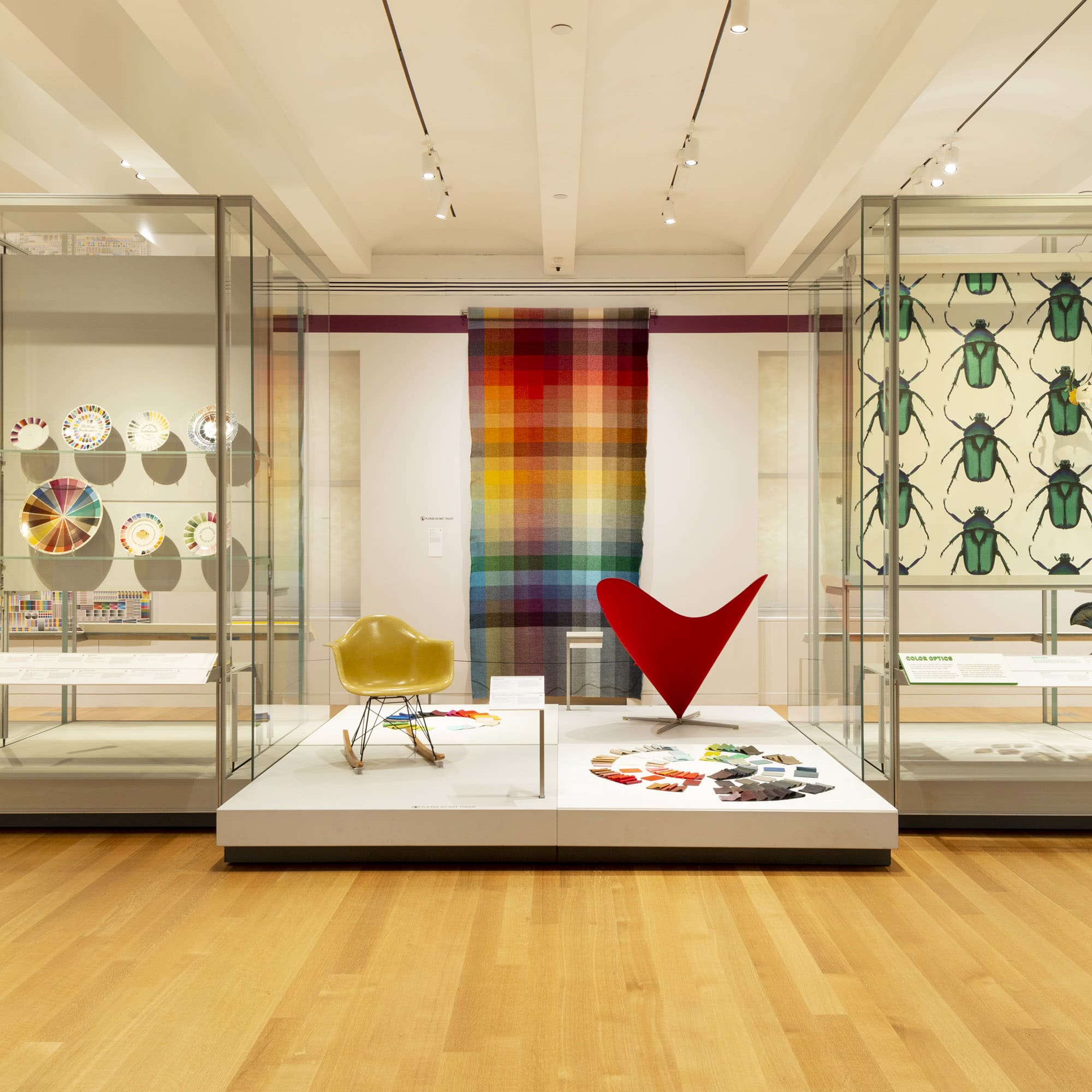
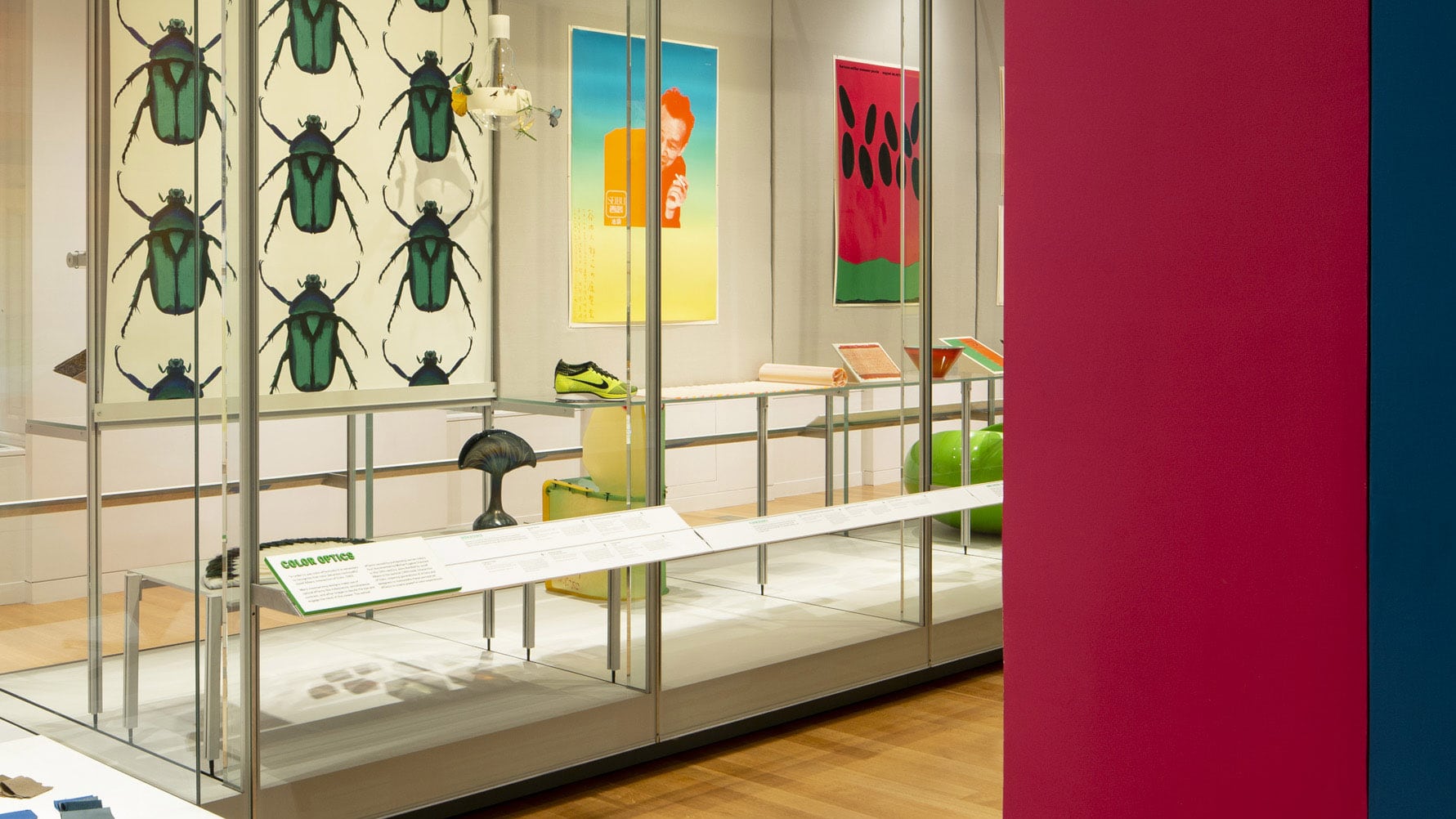
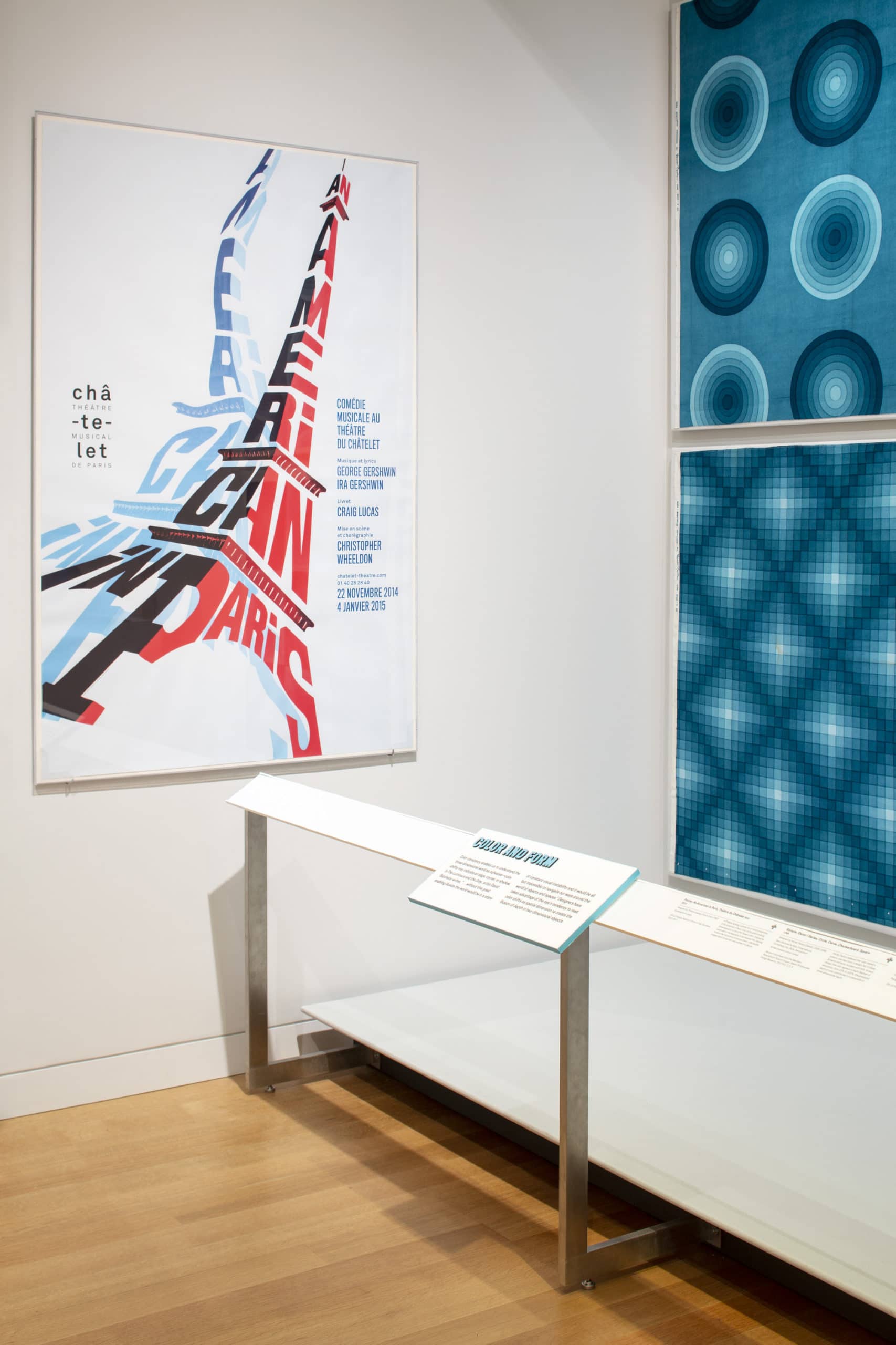
Open from May 2018 through March 2019, the exhibition featured a diverse selection of the permanent collection, including historic books and drawings, large scale posters, textiles, and industrial design objects. Organized into seven thematic groups, the show was installed across multiple rooms on the museum’s historic second floor.
The brief required a clear and easily understood exhibition design, yet the variety of objects, rooms, and thematic groupings created several challenges. How does one create a coherent exhibition within this context?
The Color Halo
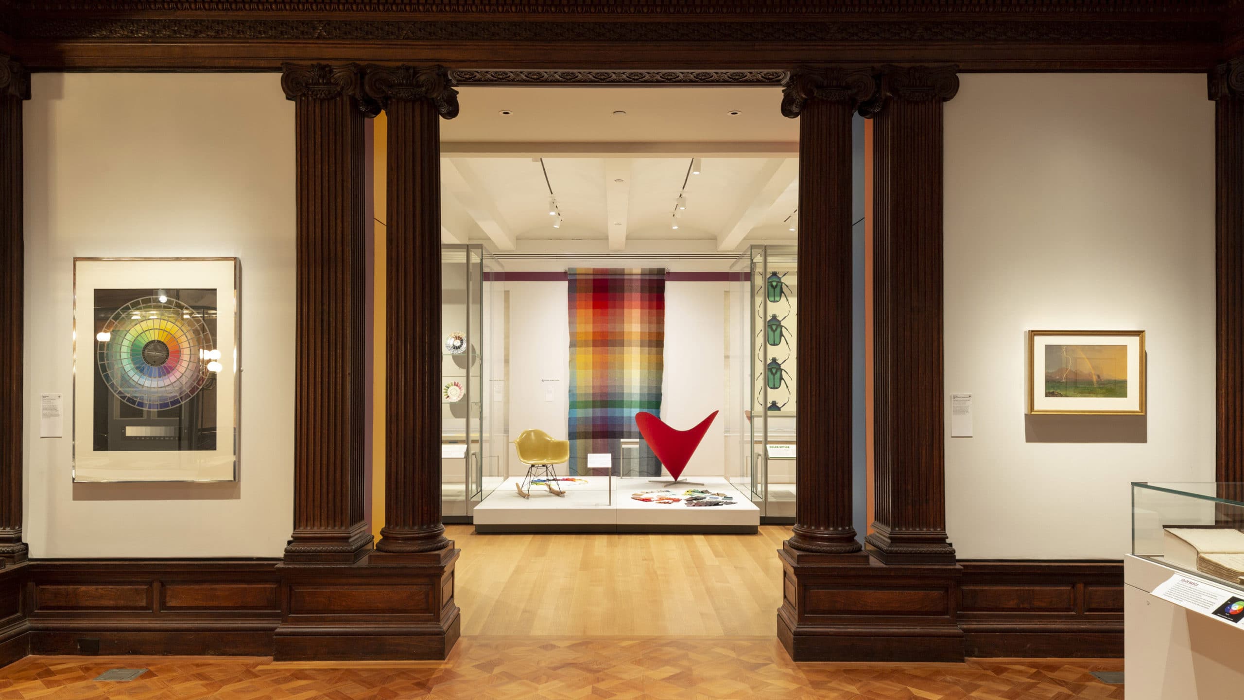
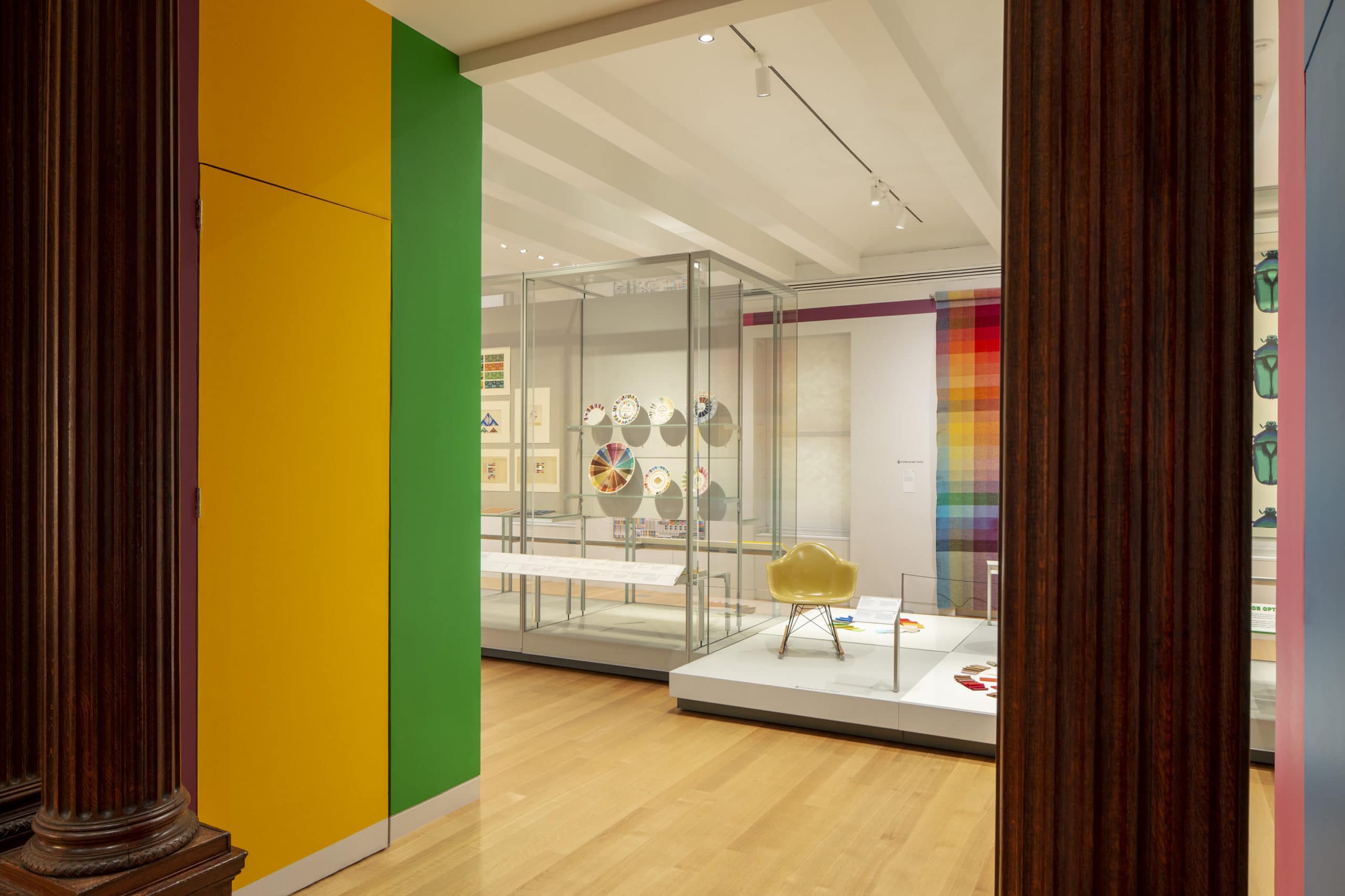
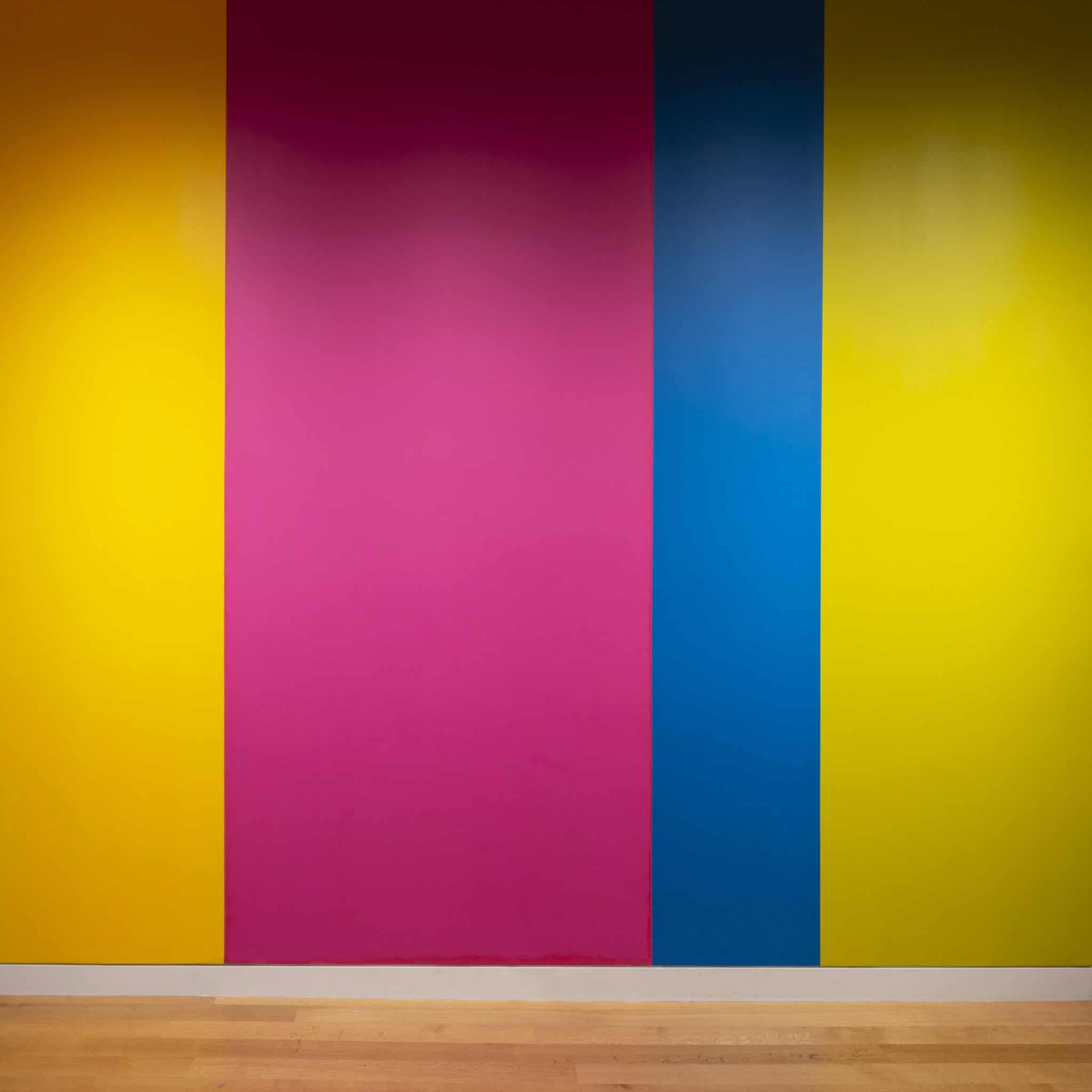
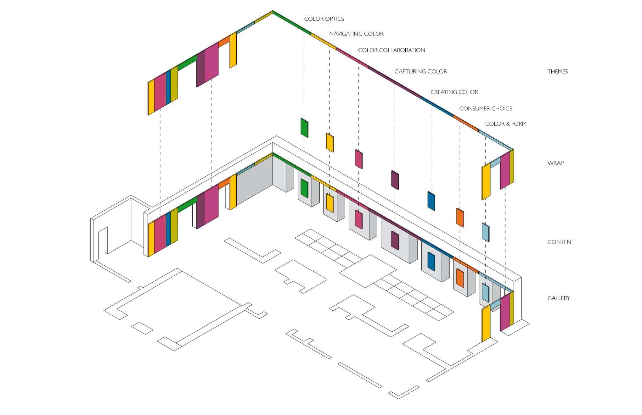
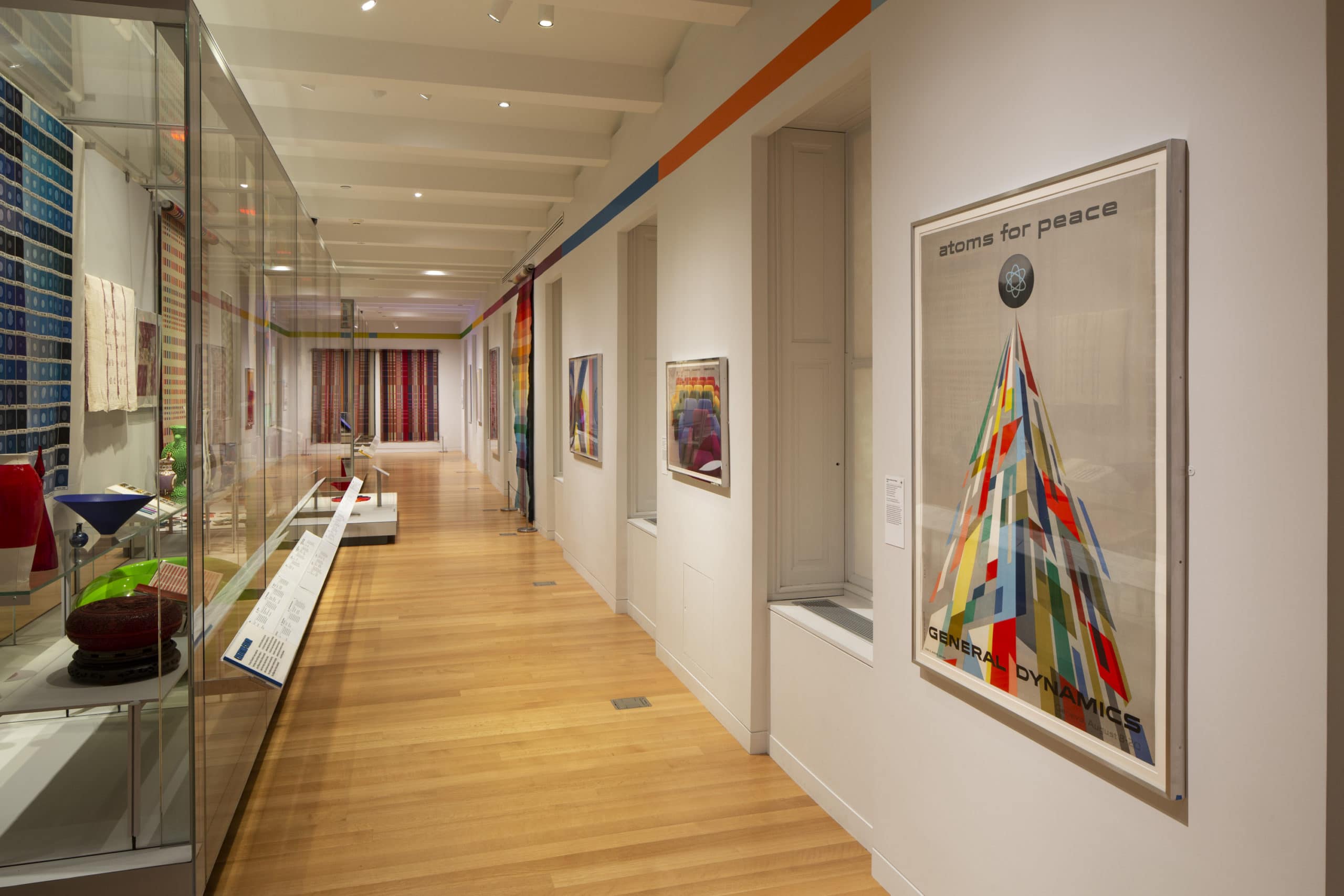
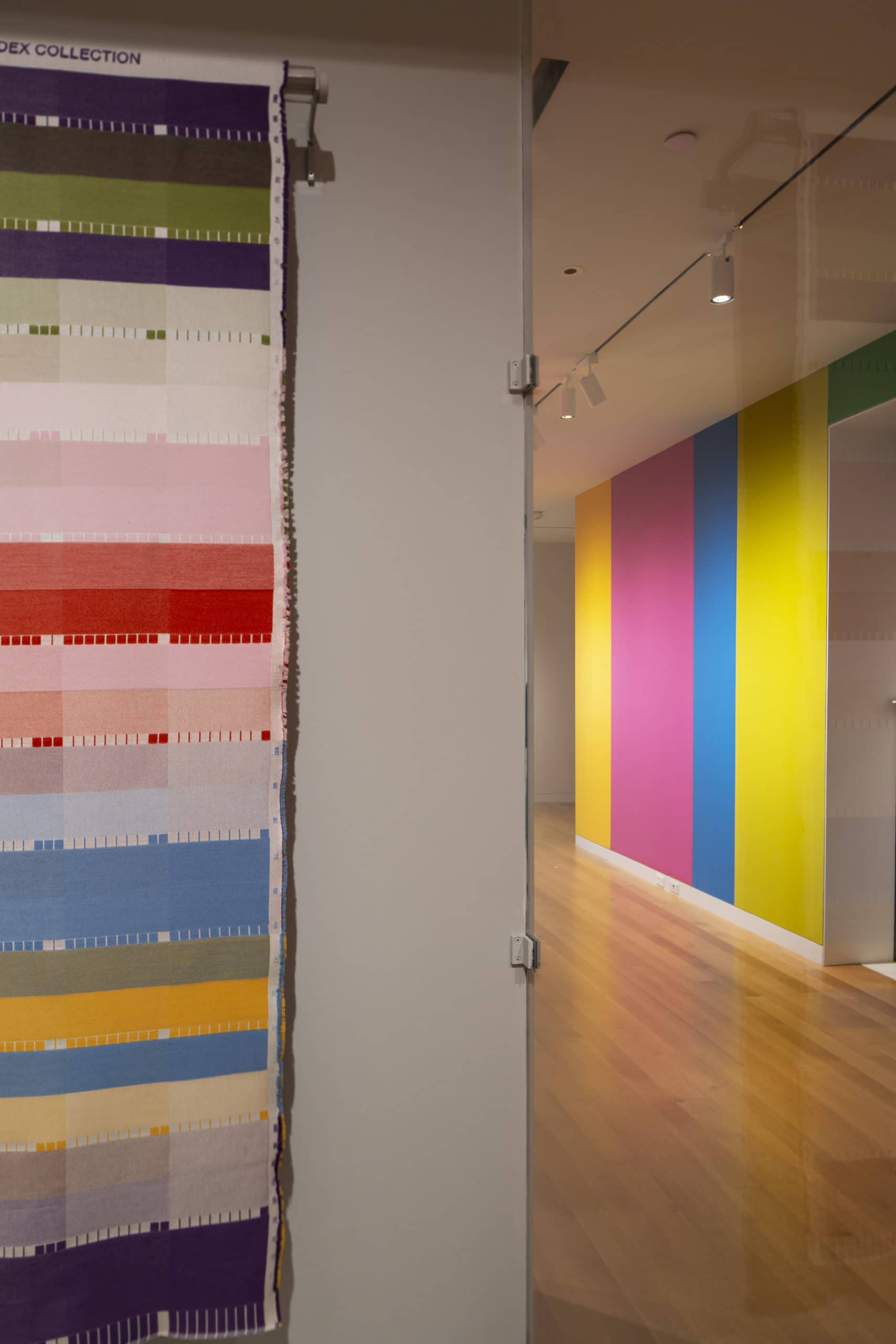
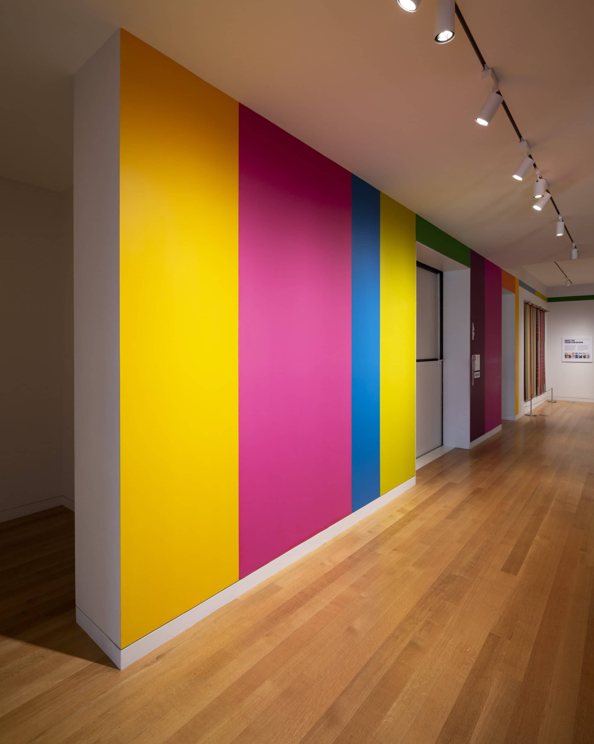
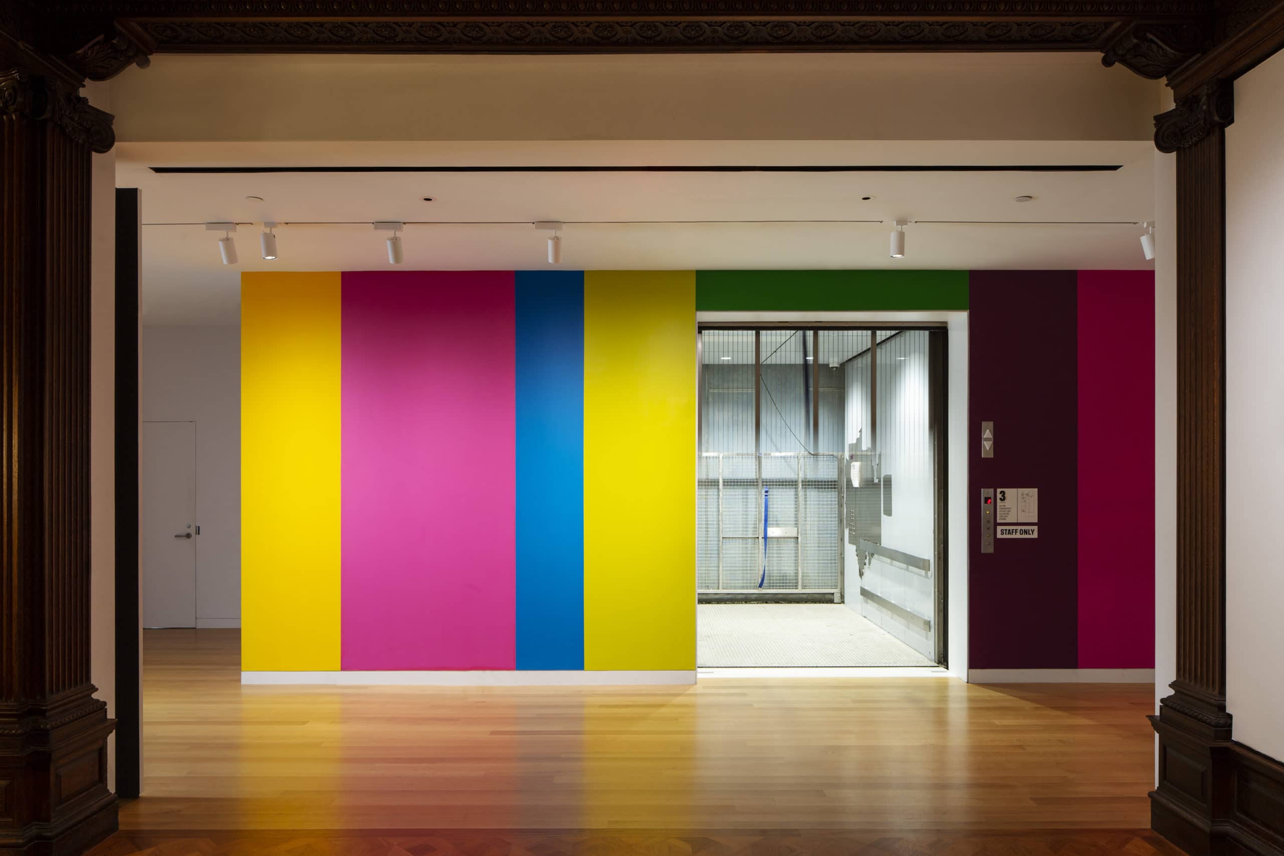
The solution is a band of color, The Halo, that wraps around the exhibition to visually connect the primary spaces. In areas where objects are displayed, the Halo becomes a slender band above eye level. Where no objects are shown, the Halo goes to the floor, creating a strong graphic identity for the show.
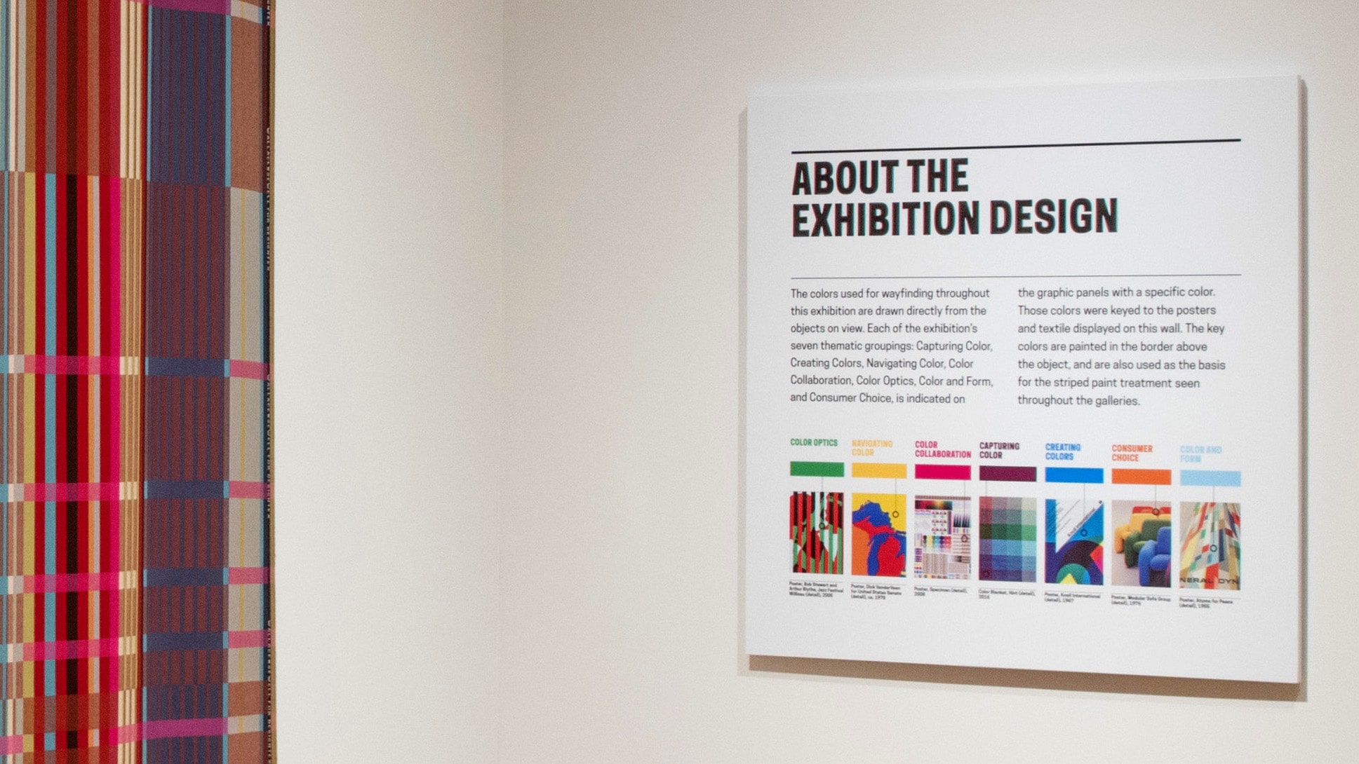
The colors used in the Halo relate to key objects in the exhibition. One object from each thematic section was highlighted, and a color from that object is used for graphics and text throughout the section.
To determine the Halo colors, we worked with the actual objects, selecting key colors and then visually matching them to standard paint offerings from Benjamin Moore. The diagram below shows an early iteration in the development of the Halo.
The end result was a strong graphic identity that strengthened the show’s thematic organization while simplifying navigation and enriching the visitor experience.
An additional challenge for the design was the integration of explanatory text, particularly to introduce the seven themes. This content is typically applied to a wall. However, the Carnegie Mansion’s historic wood and plaster work offer limited wall area for text panels. To convey the level of detail required, a new solution was needed.
TEXT PANELS
The solution is a new type of text panel, integrated into the museum’s existing label rail system and color-coordinated with the Halo. These panels place the content directly adjacent to the objects, rather than on a gallery wall some distance away. In the past, this information was often positioned behind the visitor and therefore easily overlooked.
As part of the larger exhibition design, our team also coordinated several large scale special installations, including a large scale mosaic wallcovering (“Peony” by Maharam), a 3D wall paper (“Bloom” by LuzElena Wood and twenty2), and an immersive color changing environment with RGB wallpaper by Carnovsky.
This exhibition was conceived and curated by Susan Brown of the Cooper Hewitt and Jennifer Cohlman-Bracchi of the Smithsonian Libraries. The exhibition design was a collaboration of Field Guide and William Watson of Castro Watson. Meredith Woolfolk added special expertise on color matching.